


By Alex Ren • Suspension engineer and test lead (dyno + road logging)
Commuter riders complain about the same thing every week: the bike feels buzzy and harsh over small ripples, manhole lips, and patchy asphalt. Here’s the deal—if you can show two simple visuals, a before–after shock dyno overlay and a piston-rod speed histogram from a short ride, you can translate “numbers” into “this will feel better on your commute.” Why do those two graphs matter so much, and how do you explain them quickly at the counter?
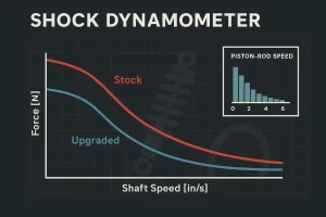
How to read a force–velocity curve without scaring anyone
Think of the force–velocity curve as a map of how the shock resists motion at different shaft speeds. The vertical axis is damping force; the horizontal axis is shaft speed in inches per second. Compression force is usually plotted positive, rebound negative. The low-speed region (roughly 0–2 in/s) controls platform and small inputs; mid-speed (about 2–6 in/s) handles quick transitions; high-speed (>6 in/s) covers sharp hits like potholes and curb strikes.
If the low-speed compression forces are too high, the shock resists tiny movements and transfers “buzz” to the rider’s hands and seat. Too much low-speed rebound and the bike feels slow to reset, stacking harshness over back‑to‑back ripples. A well-tuned upgrade will typically reduce low-speed compression force while balancing low-speed rebound so the chassis settles cleanly. That’s the comfort story in plain English.

Caption: Representative overlay at controlled oil temperature. Blue (upgraded) shows lower low‑speed compression (0–2 in/s) and a slightly softer rebound slope than red (stock). Translation for riders: less small‑bump buzz, quicker reset between ripples.
Core evidence: the before–after overlay riders can feel
Show the stock (red) and upgraded (blue) curves on the same axes. Point to the 0–2 in/s band and say: “This zone is where most commuting lives. Notice how the blue curve is a little lower here? That means the shock allows tiny movements instead of sending a buzz to your wrists.” Then trace the rebound side: “Here the slope is balanced—enough control to avoid a loose feeling, but not so much that the bike feels stuck down.”
If you anchor the conversation on this exact region, the shock dyno road test piston speed histogram upgrade value message lands naturally: the graphs are evidence, and the feel is the benefit.
Real‑road proof: a piston‑rod speed histogram from a 10‑minute urban ride
A histogram answers a simple question: how much of the ride happens at each shaft speed? On urban routes, most of the time falls under 2 in/s. That’s why changes in the low‑speed portion of the dyno curve correlate so strongly with comfort.

Caption: Representative urban commute; 12°C ambient; 5–10 minute segment. Most time-share sits in 0.5–1 and 1–2 in/s bins, with only brief excursions above 4 in/s. That’s the same low‑speed band highlighted on the dyno plot.
When a rider asks, “So what will I feel?” you can now connect bins to sensations: more time in the low‑speed band means any reduction in low‑speed compression force shows up as less chatter and fewer tingling hands after a long ride. For foundational definitions on how low vs. high‑speed damping maps to feel, see Penske Racing Shocks’ plain‑language primers on reading dyno graphs and low‑ vs high‑speed behavior: the company explains that 0–2 in/s governs platform and small inputs in practical terms in its How to Read a Shock Dyno Graph (2021) and low‑ vs high‑speed damping overview (2022).
- Reference: clear explanations of force–velocity plots in Suspension Secrets’ Damper Dyno Graphs Explained (2021) and in Penske’s PDF primer. Those resources align with the rider‑facing story presented here.
Dealer demo toolkit: say it, show it, then let them feel it
60–90 second floor script (spoken as you point): “This axis is shock shaft speed; most commuting lives under two inches per second. Here’s the stock curve—see how high it sits in this band? That’s the buzz you’re feeling over small ripples. Our upgraded setup drops that low‑speed compression slightly and balances the rebound slope, so the wheel can move a touch more and the bike resets between ripples. On the road, that translates to less chatter in the bars and fewer little hits in the seat. Let’s do a short loop and you can tell me whether your hands feel calmer at the same pace.”
Micro‑example: pothole series. On stock settings with higher low‑speed rebound, the bike can feel “hung up” after the first hole, so the second and third hit harder. The upgraded curve’s gentler rebound slope lets the tire return sooner, so each impact is dealt with on its own—less stacking, less sting.
Micro‑example: curb ramp at a shallow angle. Excess low‑speed compression on stock shocks can transmit a sharp kick. With the upgraded curve, initial force is trimmed in the 0–2 in/s zone, so the tire starts moving sooner and the edge feels more like a muted thud than a slap.
Practical example (neutral brand reference): When a shock or cartridge kit has been dyno‑validated with before–after overlays and matched to road logs, you can show riders exactly what changed. For instance, some partners reference lab‑controlled overlays as part of their performance pages; see the dyno‑validated approach described on the Kingham Tech Performance Suspension overview, which explains how force–velocity data supports setup decisions for everyday riding. Link: Kingham Tech performance suspension for motorcycle.
Minimal reproducible test protocol (dealer level)
- Precondition the damper with 5–10 warm‑up cycles until readings stabilize; note ambient and oil temperature. Then record 2–3 constant‑velocity sweeps covering 0–6 in/s (extend to 10–12 in/s if your dyno allows) with consistent stroke for both “before” and “after.”
- Record clicker positions and any valving changes, and overlay runs to verify stability. Keep the oil temperature window consistent across configurations.
- Optional road log: capture a 5–10 minute urban loop and export a simple shaft‑speed histogram with bins such as <0.5, 0.5–1, 1–2, 2–4, >4 in/s. Label it “representative” unless you’re repeating the exact same route and load each time.
- For readers who care about process assurance and supplier test rigs, see the manufacturing and QA overview under Kingham Tech OEM/ODM partner, which describes lab validation capabilities alongside production controls.
Printable one‑page cheat sheet for the counter
- Say this: “Most of your commute lives under 2 in/s shaft speed. We trimmed low‑speed compression here and balanced rebound, so tiny ripples move the wheel more and your hands buzz less.” Show this: point at the 0–2 in/s band on the overlay where the blue curve sits below red.
- Say this: “If rebound is too heavy at low speeds, the bike feels stuck between ripples.” Show this: trace the rebound side and note the upgraded slope is slightly softer, enabling a quicker reset.
- Say this: “This histogram is from a short city loop—see how most of it sits in the low‑speed bins?” Show this: the shaded 0–2 in/s region on the histogram and connect it back to the same zone on the dyno plot.
Sources and notes
If you’d like to go deeper on interpreting force–velocity plots and the low‑/high‑speed split, the following primers are clear and widely cited:
- According to the Penske Racing Shocks guide How to Read a Shock Dyno Graph (2021), low‑speed regions govern platform and small inputs; the article also clarifies sign conventions and sweep types. See: Penske’s dyno-graph guide and the companion PDF primer (2021): How To Read A Dyno Graph.
- For a concise explanation of low‑ vs high‑speed damping and practical boundaries used in motorsport, see Penske’s overview (2022): Difference Between Low‑Speed and High‑Speed Damping.
- For curve shapes (linear, digressive, progressive) and what they imply, see Suspension Secrets’ Damper Dyno Graphs Explained.
- For context on real‑world suspension velocity analysis (different discipline but relevant to the “velocity bands” concept), see Motoklik’s discussion of suspension speeds in motocross (2023): Average speed of suspension in motocross.
Note on visuals: The overlay and histogram shown here are representative examples created to illustrate the method; when presenting to a customer, use your own controlled before–after runs and, when possible, a short road log from your test loop.
Closing: help riders feel the proof
Now you can connect lab curves to street feel in under two minutes: point at 0–2 in/s on the force–velocity overlay, show the road histogram that lives in the same band, and describe the changed sensations—less buzz, cleaner resets, more comfort at the same pace. If you’d like sample overlays or a simple template you can reuse in your shop, you can request a neutral, rider‑facing example set from Kingham Tech; we’re happy to share how we present the data so you can adapt it to your own platform and route.